

Table of Contents
As per Statista, an estimated 36.8 billion downloads of apps from the App Store and Play Store were made in the first quarter of 2022. With so many apps being downloaded, it’s no surprise that over 70% of users are anticipated to churn across all categories in the app stores within 90 days.
If a navigation design or any part of the app is unappealing, users will choose to install a new one instead of continuing to use the flawed app. When a customer deletes an app, he or she loses nothing other than possibly a few dollars. However, on the other hand, you’ll lose a valuable business idea!
So, avoiding some common navigation design mistakes will help businesses in creating apps with better user experience and help your business to cross the 90 days threshold efficiently.

The Ultimate Checklist for Building An Incredible Mobile App
Get your free copy
Let’s discuss 5 common mobile app navigation design mistakes that you should avoid and take preventative measures to enhance your app:
5 Common Mobile App Navigation Design Mistakes
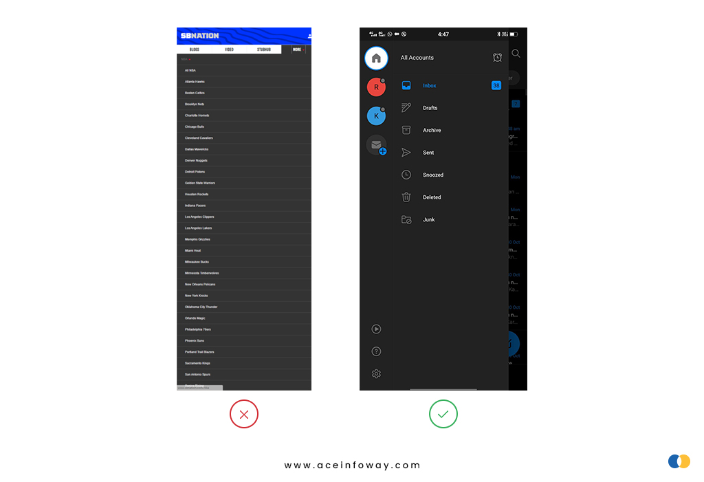
1) Your Navigation Menu Has Too Many Options
The primary mobile navigation menu of the app can be accessed via the navigation menu. Therefore, if the opportunities in the primary navigation menu are too many, users can get confused and quit the app without taking any action.
Take an example of a restaurant menu, if you have so many dish options you get confused & overwhelmed and it is often hard to decide on the best dish. It’s the same with apps. Users will just leave an app if it has an extensive list of items that they find difficult to quickly comprehend.
💡Practical Recommendation:
It is better to keep the primary navigation menu precise and short. So, users can quickly scan the entire menu without taking too much time. The clearer your UX navigation for the menu is to the users, the better the designers have done the job.
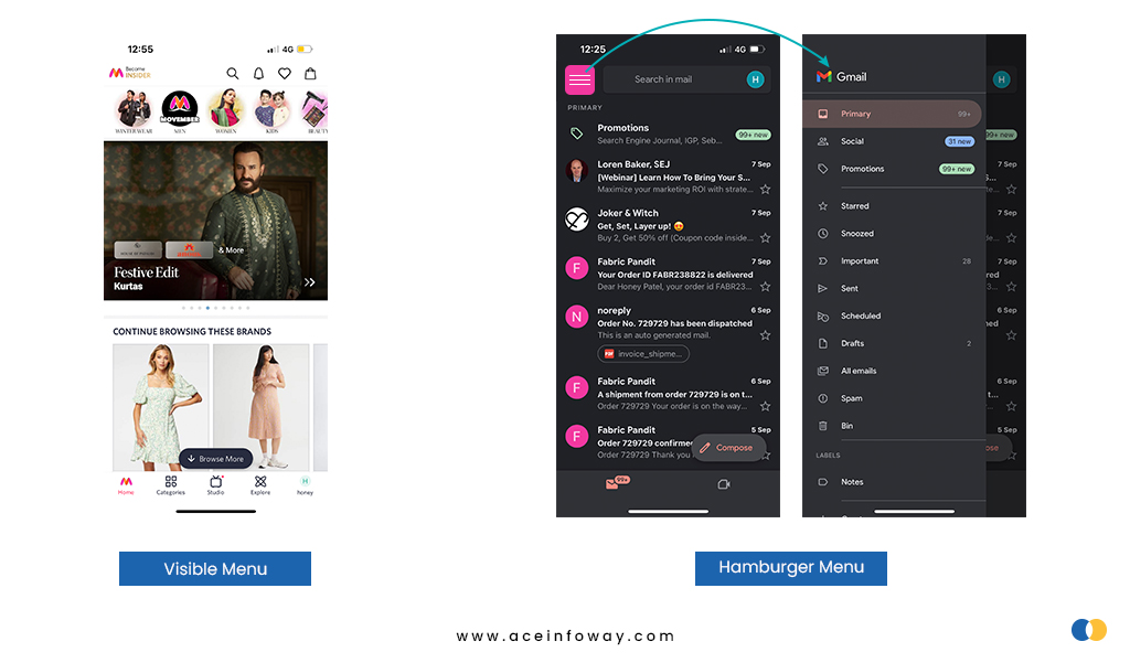
2) Hidden Navigation Menu
Hidden navigation menu like a hamburger menu has hoover through navigation components in an app like a hurricane. No trend, though, is without its critics.
Out of sight, out of mind is the fundamental root of the problem with hidden menus. Users are less likely to tap on a menu when they can’t see it. Using a hidden navigation menu to discover what you want requires more cognitive work.
Users don’t use their mobile phones in a perfectly focused way, like a usability test. They often have several things on their minds at once, so if your navigation isn’t visible, then it might drive potential users away.
💡Practical Recommendation:
Hamburger menus or hidden navigation menus are great for all secondary navigation menus. Therefore, the common advice is to use visible navigation, where the primary navigation choices are shown in a visible navigation bar, or combination navigation, where some of the primary navigation options are visible and others are concealed under an interactive element.
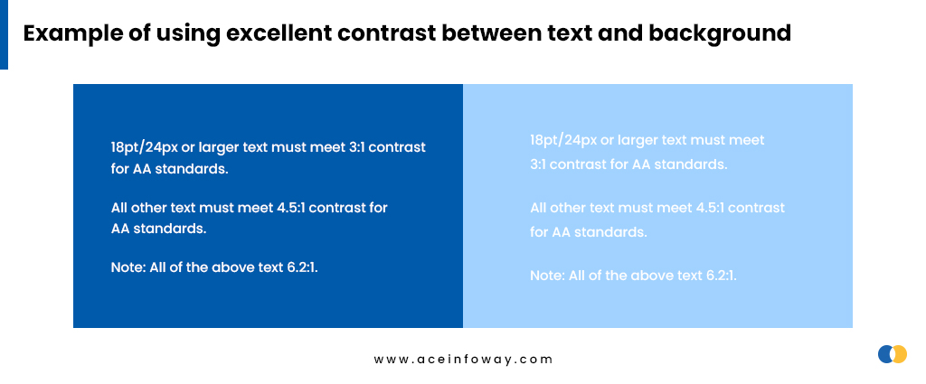
3) Using The Wrong Colors
Around 300 million individuals worldwide are believed to have a color vision deficiency. 1 in 12 men and 1 in 200 women are color blind. Therefore, the majority of designers don’t face color blindness issues, so it’s easy to forget that we’re developing for this specific user group too.
While using light fonts on light backgrounds in the mobile navigation menu may look elegant but in this type of color contrast, the content/menu is unreadable. Additionally, using light fonts in small body text may cause usability issues. Users are likely to uninstall your app if it has a visually appealing UI but is challenging to understand.
💡Practical Recommendation:
For a great user experience, app designers and developers must create fonts readable and provide excellent contrast between text and background. In addition, you will be much closer to professionally selecting colors and designing an appealing app if you use tools like Coolors, Palettr, etc. to assist you to build color combinations rather than picking colors at random.
4) Avoid using jargon that users don’t understand
Jargon when used in mobile apps to impress customers will have a negative impact if not understood by the customers. Speak in the same language as your customers. Unfamiliar words or phrases will increase the cognitive load of the user. Professional jargon and brand message should never take precedence over clear communication and functionality.
💡Practical Recommendation:
Avoid using jargon when explaining non-specialized subjects. Additionally, avoid using jargon just because you think it sounds sophisticated. (Really, you’re more likely to come across as arrogant if you use jargon needlessly.)
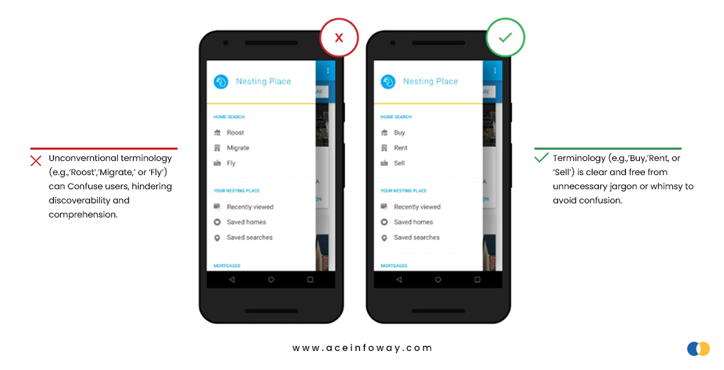
It might be challenging to avoid jargon. So, we’d suggest following a few basic guidelines when using jargon in an app:
- Know your audience
- Determine each user’s tech knowledge
- Provide context
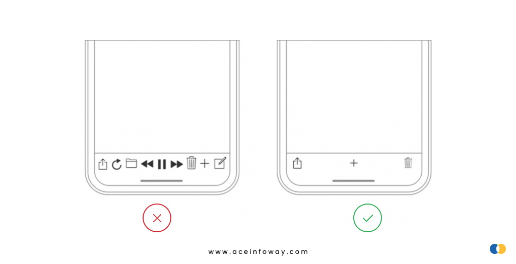
5) Cluttering up the user interface
A cluttered user interface overwhelms the user with too much information; each additional button, image, and line of text complicates the screen. On a desktop, clutter is awful, but on mobile devices, where users have little screen real estate, clutter is even worse.
Even if all of your content is relevant and engaging, cluttering your app with too much information will simply turn visitors away.
💡Practical Recommendation:
If you have a lot of information to display, use progressive disclosure, if possible. In other words, additional alternatives are shown as the user clicks or hovers over the interface. Content should only be visible when the user requests to view it.
Concentrate on the content or information that is helpful to your users. Remove unnecessary elements that do not assist user tasks. Keep the interface light and airy by using a few aesthetic elements, such as gradients and drop shadows.
Conclusion
The process of app navigation design is long and requires lots of effort. The team might accidentally make some of the mistakes listed above. In the future or while designing an app, try to stay away from these common mistakes since they often need design changes, which increases your post-design efforts.
Designers need to be up-to-date on user behavior trends and customer psychology. The most crucial consideration when building an app is to consider the user’s point of view. Never choose or reject a color, font, or design based only on personal preference. Instead, do your research and follow the trend.
Get Partnered with an Experienced Mobile App Development Company

Custom Mobile app development will be a significant investment for your company. So, choosing the right and trusted team will be worth your efforts. Ace Infoway is a leading mobile app development company that assists its clients globally in mobile app design and development.
Our team works collaboratively to understand your business, your competitors, and your customers. Our goal is to design and develop an application that meets the needs and expectations of our clients. Let’s connect to start your next mobile app project.