

Table of Contents
According to the data released by Business of Apps, 49% of the downloaded are uninstalled by users within a month. The foremost concern for mobile app owners is to make users engaged with the app and provide the best UX. Mobile app accessibility is a prime factor that impacts user engagement and the success of the mobile app.
Ensuring proper accessibility for apps can encourage users to continually visit the app and engage with the product, tools, services, and products available. Conversely, substandard app accessibility could lead to app abandonment, and in the worst case, the user may uninstall the app due to its ineffectiveness or poor user experience.
Mobile App Accessibility Guidelines
Get your free copy
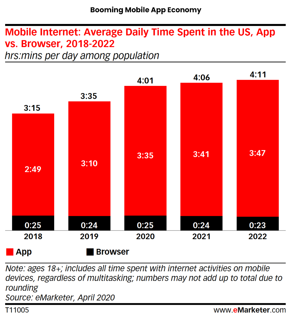
255 Billion Mobile Apps Downloaded!
As per the data, in the year 2022 people from around the globe have downloaded around 255 billion mobile apps. The data itself shows why the success or failure of any business or service depends on the accessibility of mobile apps.
A study suggests average American checks their mobile phone around 344 times a day, which means the user checks his or her mobile once after every 4 minutes.
Smartphone users spend much less time on browsers as compared to mobile apps. A study was conducted and it estimated that an average US adult will spend 4 hours and 6 minutes on mobile apps, surpassing the browser. Nearby 92.5 % of internet time is spent on mobile apps limiting browsers to 7.5%.
To leverage this booming app economy you must focus on enhancing accessibility for apps so that you can provide the best UI/UX to the users and make them use your mobile app frequently.
If you are concerned about how you can make your mobile app more accessible then here are the proven and practical tips for app accessibility that could help you improve the accessibility of your mobile app.
Navigation: Focus on Touch Targets
In simple words, navigation is a map for your user- if designed poorly user might feel lost, eventually abandoning the app owing to bad UX.
The thumb rule is mobile navigation should be intuitive and seamless allowing users to enjoy and access all the features, tools, services, categories, and products available in the mobile app with proper color contrast for easy search.
The most crucial part is where and how you place your navigation bars, hamburger menu, and most importantly touch targets.
While designing navigation and placing the icons, one should know where to place them and make them easily accessible in the app with one thumb without stretching it. For example, placing the frequently used tools and features on the top of the bar makes no sense, it is an ideal place for search or Logo (to navigate to the home page).
Placing important or frequently used icons or tools at the bottom of the screen gives a convenient user experience. You can also dedicate a major part of the screen to navigation, popularly known as a navigation hub.
While designing navigation finger and hand positioning plays an important role. It is crucial to align the thumb zone along the bottom and frequent clickable elements in the center of the page to make it used single-hand.
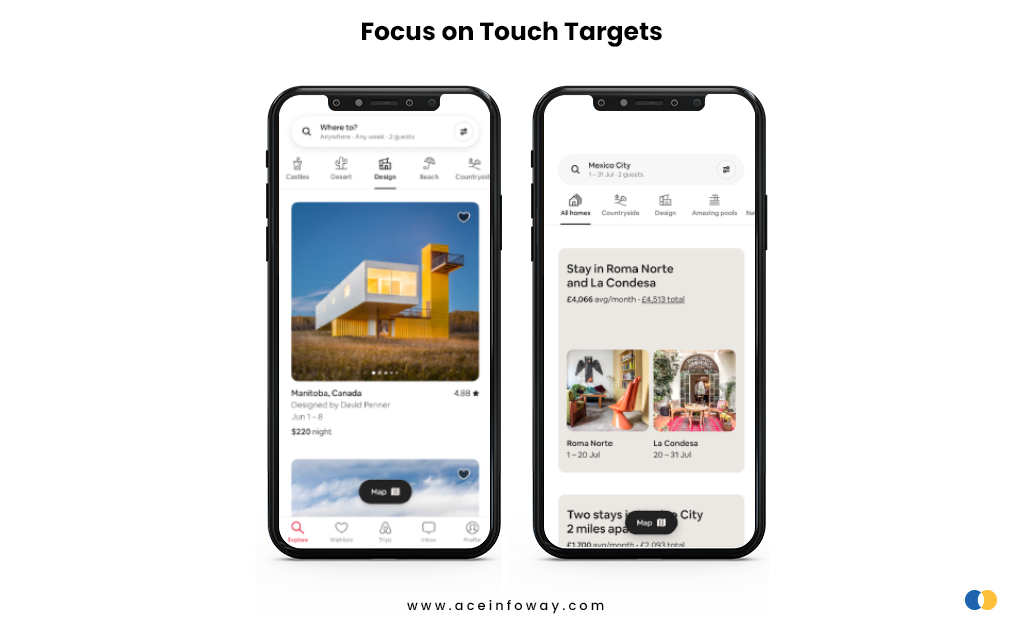
Airbnb’s app provides convenient navigation to the user having icons that are easy to identify, a proper thumb zone to click, and frequently used tools at the bottom.
Icons: Make it Comprehensive
Icon plays a major role in making the mobile app accessible. So, placing and selecting the icon with the correct image is crucial as it can impact the overall user experience. Icons are signboards of the mobile app that guides the user to use the app accurately. Could you reach your destination with incorrect signboards on the highway?
Being too creative with the icons can make mobile app users have difficulty finding and apprehending the icon or tool they are looking for. It is advisable to keep the icons easily identifiable and labeled too.
Some universal icons are used to depict certain tools and it is advisable to use those icons because the majority of the users are habituated to using certain icons for a specific purpose only- for example using a house icon to navigate to the homepage, the magnifying lens to search, a dollar sign for payment.
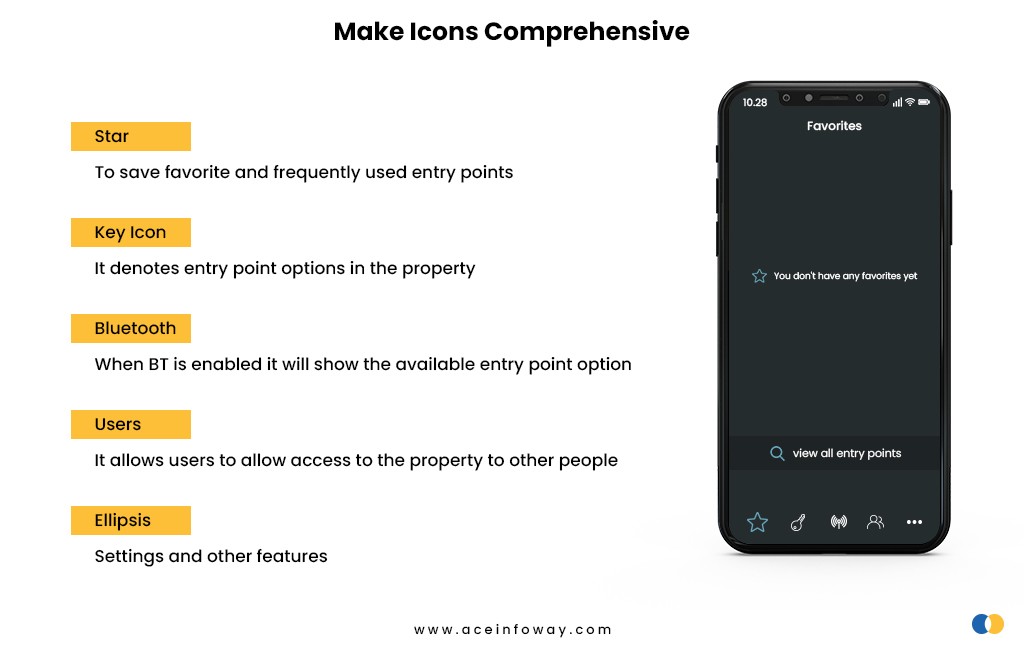
Above image is taken from one of the mobile apps that provide keyless entry into the property to multiple users. It might be difficult for you to identify the icons if you are using them for the first time. Firstly, the size of the icon is too small as well as the icons are not labeled making it more difficult for users to get comprehend them.
For your understanding, the icons are
- Star: To save favorite and frequently used entry points
- Key Icon: It denotes entry point options in the property
- Bluetooth: When BT is enabled it will show the available entry point option
- Users: It allows users to allow access to the property to other people
- Ellipsis: Settings and other features
Keeping icons easily accessible, and identifiable with appropriate size using proper color contrast can enhance the accessibility of the mobile app. Having an easy menu will help elderly people, users with physical and vision impairment, and less educated and low techno-savvy users.
Size Matters: Consider Varying Screen Size
The layouts, font-icon size, and content volume should be designed keeping the screen sizes of different mobiles and tabs. The designer must design it in such a way that it dynamically fits the screen irrespective of screen size-from small to the largest mobile screen.
Mobile app accessibility can be improved by making it inclusive for all types of users. For instance, some user feels comfortable using mobile in landscape mode only, so dynamic typography could help in both portrait as well as landscape mode.
Keeping the screen clutter-free, compact screens, and custom aspect ratio are the benchmark of smartphones. Though smaller screens limit the size of information we can convey so it is advisable to keep it minimal on each page making it for users.
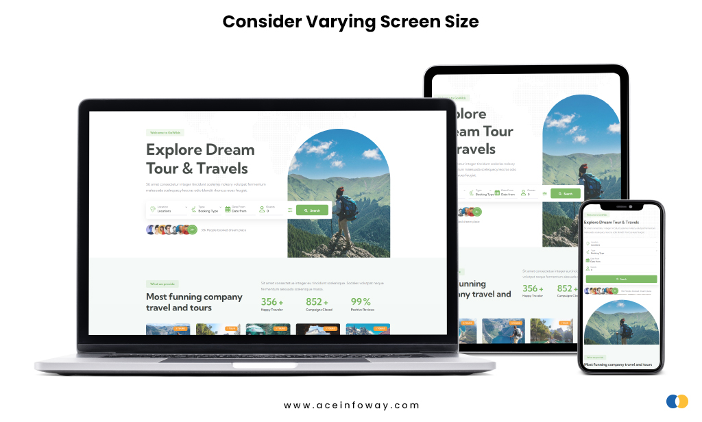
Adapting the length of link text to the viewport width, using captioned pictures, and using default size for content can help elderly users or users with low vision to use the app without zooming in and out.
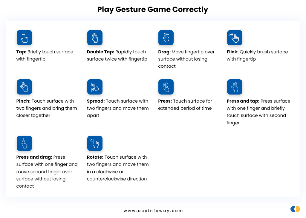
Play Gesture Game Correctly
The accessibility of the mobile app can be measured by how effectively the designer has implied gestures on the app. Mobile apps are predominantly designed to work through gestures on the touchscreen.
Gestures such as single tap or click, double tap or click, swipe, pinch, and long touch is used to navigate the app having different tools, product, or services.
While providing the gestures it is advisable to keep them aligned with universal trends and also consider elderly users, physically-visibly impaired users, or users having motor or dexterity impairments.
So what are the measures we can take to make the mobile app accessible with gestures?
- Keep the gestures simple
- Easy access to go back in case of unintentional click or tap
- Keeping icon and font size reasonably big and bold
- Make sure buttons are in contrast with the screen background
- Keep the keyboard easily accessible
- Give an alternative to gesture if a user is not comfortable with it
The reason for suggesting big fonts, icons, and buttons many times users could be better with tapping and clicking or maybe having shaking hands due to their age. In such instances to avoid unintentional clicking and give smooth mobile accessibility specific measures are helpful.
Try to Make it Inclusive
Inclusiveness is one of the major factors that affect mobile app accessibility. Making the app inclusive will help in attracting more active users and eventually helps in delivering a great user experience.
To make the app inclusive for all designers need to keep certain things in mind considering the target audience.
Designers need to consider the demographic, literacy rate, and age of the users while designing it.
For example, a less educated user may not be able to read the caption but he or she can surely understand the icon image. So, the icon’s picture could help the user to use or navigate the app.
Mobile App Accessibility Guidelines
Get your free copy
In another instance, having a screen reader in the app could help users with vision impairment.
Don’t let language be a barrier, if possible provide multiple language options to the users if you want to make the reach your app around the globe or connect with people using regional language.
So, while designing the app certain parameters need to get kept in mind to enhance the mobile app accessibility.
Conclusion
To enhance accessibility for the apps the design team needs to have certain parameters in mind to make them usable for all sorts of users. Because sometimes too much creativity could create a complex design so the app design should be designed with a blend of simplicity, creativity & sensitivity to improve accessibility for mobile apps.
Every mobile app has different products, services, and tools- eventually have diversified users and target audiences belonging to different demographics, ages, and socioeconomic classes. So, the designer should design the mobile app with a different approach keeping all related parameters in mind.
If you are facing any issues with mobile app accessibility and ineffective accessibility in apps is costing you, users, then feel free to ask for help from us. Our team of experts will provide you with guidance and assist you to make your mobile app more accessible.